Out & About
Bubbly water with a little kick.
OPPORTUNITY
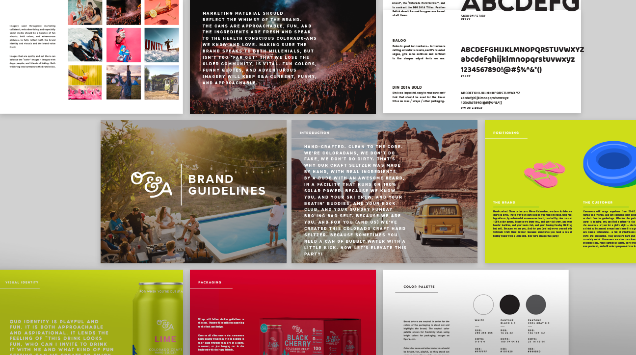
Modern consumers demand modern products. That message has always been true and is now reverberating in the craft beverage industry, where hard, craft seltzers are one of the fastest growing sectors among discerning, health-conscious imbibers who still like to get a little adventurous at times. Denver Beer Company came to us to handle every aspect of branding for Out & About Hard Cider, from name exploration to color palette selection to packaging and can design.
APPROACH
Denver Beer Company wanted to create an offshoot brand that connected with the values young, active Coloradans value most, and that’s just what we did. We created a brand image that focused on the natural ingredients, low-calorie count, and handcrafted quality of Out & About, as well as the brand’s sustainable business practices. The name “Out & About” alone conveys a lifestyle of movement, regardless of whether that movement is hiking a 14er or floating around at a friend’s pool. We created media assets, wrote copy, and designed a can that spoke to the essence of the responsibly adventurous Coloradan millennial, focusing on Colorado’s boundless natural beauty.

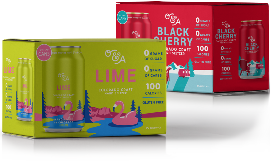
WE COME IN COLORS
The O&A color palette is bright and fancy, so as to grab the attention of buyers walking past it on a shelf and leave a lasting buyer’s impression on them from the minute they crack open a fresh can until the moment they finish their last sip. Plus, the colors pair well with your favorite river costumes and spring skiing onesies, which is a nice perk.
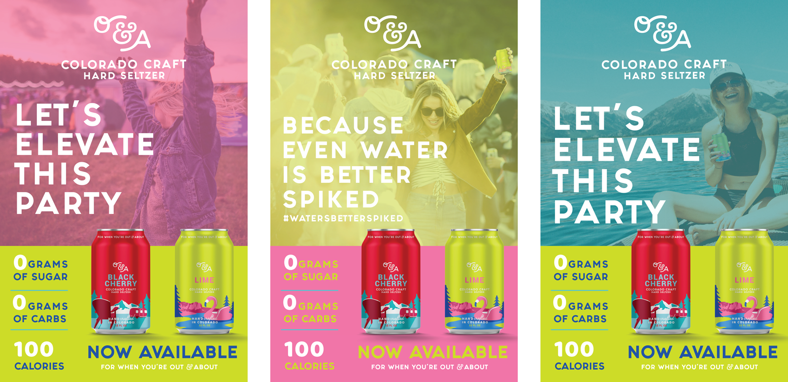
The Colorado Lifestyle
You live in Colorado because of the limitless opportunities it provides you to indulge your interests–whether that’s a weekend rafting the Arkansas or hanging out in Downtown Denver. So Out & About’s marketing reflects that.
The brand imagery shows paddleboarders and dancing festivalgoers alike while the messaging calls attention to important facts about the product–mainly, that it’s light enough to not prevent you from paddle boarding or dancing at music fests! With all the above in place, Out & About is set to launch this summer–and we couldn’t be more excited.